Apple’s iPhone 16 Pro website serves as a leading example of premium digital product marketing, especially in its carefully constructed product detail pages. Through years of market dominance, research-driven design, and a rare ability to justify premium pricing, Apple has refined a persuasive conversion framework specifically tailored to strategically build purchase confidence within the confines of individual product detail pages.
For any brand selling high-value products online, the principles embedded in Apple’s product detail page design offer invaluable insights for optimizing conversion through targeted persuasion structures.
Series Overview
- The Structure of High-Converting Landing Pages
- Landing Page Design Elements That Drive Conversions
- Conversion Rate Optimization Framework
Key Takeaways
High-converting landing pages rely on a strategic information structure — and Apple’s iPhone 16 Pro landing page—particularly product detail page— offers a clear example of how the AIDA model (Attention, Interest, Desire, Action) can guide users through each stage of the consumer decision journey.
- The attention stage is critical for landing page success, requiring instant value delivery within seconds.
- High-converting landing pages sustain interest by enabling curiosity-driven exploration.
- To spark ownership desire, the product must feel personally relevant. This means connecting emotional appeal with logical proof—showing not just what it is, but why it matters to the user.
- To drive action, the page reinforces value, resolves doubts, removes barriers, and reframes the decision from “whether” to “which.” These strategies reduce friction and make purchase feel like a natural next step.
Apple supports desire formation by structuring contents in sync with how users process value at each stage. It moves from tangible materials to functional performance, real-world use, and identity alignment—matching the user’s readiness to internalize deeper value. Without this cognitive alignment, desire weakens and purchase intent stalls.
Strategic Narrative Architecture in High-Converting Landing Pages
Our analysis begins with this broader view — decoding how Apple’s macro-level information structure taps into consumer psychology. This helps us identify principles that shape digital experiences where building purchase confidence is vital, especially for premium product categories.
Core Tactics 1. Information Structure Based on AIDA
iPhone 16 Pro product detail page’s information structure shows how the AIDA model outlines the psychological stages consumers experience in their journey to purchase: Attention, Interest, Desire, and Action. Each stage represents a critical psychological need that must be satisfied to advance conversion progress, creating a sequential path to purchase completion.
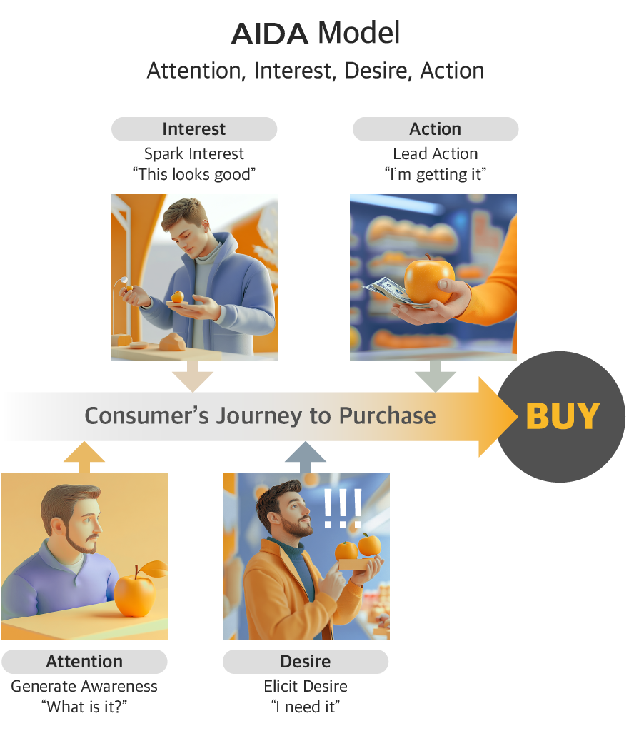
This reveals how Apple leverages sequential psychology by carefully structuring the flow of information. First, it captures attention with differentiated value (“Hello, Apple Intelligence”). Only then does it move to spark interest through feature previews. Once interest is secured via technical excellence, the focus shifts to building desire through real-world applications and personal benefits. Finally, when desire is fully formed, the site introduces purchase decision support tools — That’s the action stage.
This step-by-step progression is especially critical for premium products. Higher price points demand a stronger perception of value at each stage to justify the investment. By fully addressing each stage’s psychological and informational needs before moving on, the website maintains forward momentum while gradually reinforcing purchase confidence.
Stage-by-Stage Structure of High-Converting Landing Pages (AIDA Model)
1) Attention: Capturing Attention for High-Converting Landing Pages
The attention stage is pivotal in landing page design, as users form first impressions in just 50 milliseconds and judge credibility within 3.42 seconds (Lindgaard et al., 2006). This narrow window demands immediate value recognition and motivation to explore.
To prevent bounce from information overload, differentiation must be instant, and curiosity sparked quickly. Scroll-or-exit decisions hinge on whether users see a reason to stay.

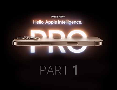
Apple’s iPhone 16 Pro “Hello, Apple Intelligence” hero section exemplifies this by delivering a single, high-impact message the moment the page loads. The stark black background isolates attention, while the bold “Pro” typography and the animated reveal of “Built for Apple Intelligence” create a sense of deliberate anticipation.
This sequencing draws the eye with intent, giving users just enough time to process each element without distraction. The minimalist visual environment, absence of clutter, and tightly choreographed motion focus the user’s cognition on one core message—this is the iPhone built for next-generation AI. In just a few seconds, Apple communicates premium positioning, innovation focus, and a reason to stay.
2) Interest: Building Interest for High-Converting Landing Pages Through Features
After capturing attention, the goal shifts to cultivating sustained interest through intrinsic motivation. Unlike the fleeting engagement of the attention stage, this phase demands content that rewards curiosity and encourages intentional exploration.

On Apple’s iPhone 16 Pro product detail page, interest is deepened through preview frames that hint at core innovations, leading users to explore further. Progressive disclosure, horizontal scrolling, and visual demonstrations streamline access to complex information—fostering a self-paced, curiosity-driven journey that reinforces the initial value promise without overwhelming the user.
3) Desire: Desire Stage Strategies for High-Converting Landing Pages
Once interest is sustained, the next step is to build a specific desire for product ownership. At this stage, the focus of persuasion shifts—from highlighting objective excellence to showing how the product fits into the user’s real life and personal values.
The messaging must help users internalize the product’s relevance. It should answer not just “Is this a good product?” but “Is this product right for me?” The content emphasizes both emotional and practical satisfaction, helping users envision the product as part of their identity and daily experience.
Apple applies this principle effectively on the iPhone 16 Pro product detail page. It structures desire-stage content around both peripheral and central routes of persuasion, following the Elaboration Likelihood Model (ELM).
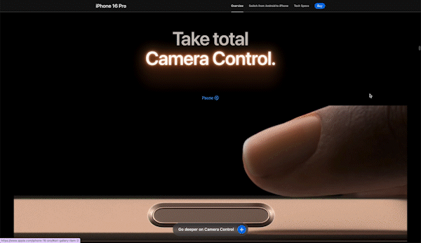
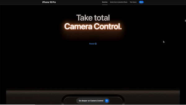
For example, the “Take total Camera Control” section introduces a physical UI inspired by the jog dials used in professional cameras. This instantly evokes the feeling of being a pro photographer. The tactile, emotionally resonant design appeals to peripheral cues.
At the same time, the site showcases real photographic results and emphasizes technical features such as resolution and image processing. This offers logical proof of what users can actually achieve, satisfying the requirements of central-route processing.
(For a deeper breakdown of how Apple applies ELM-based persuasion in the desire stage to design persuasive messages, see Part 2)
4) Action: Optimizing High-Converting Landing Pages for Action and Purchase
Apple’s iPhone 16 Pro product detail page turns intent into action through a layered persuasion sequence. It builds psychological momentum by combining rational justification, emotional reassurance, ecosystem value, friction removal, and smart decision framing. Together, these strategies guide users from hesitation to confident purchase.
(1) Value Enhancement Trilogy in High-Converting Landing Pages
Apple builds purchase conviction through three interconnected value enhancement strategies:
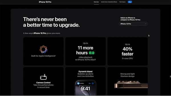
First, the comparative framing (“There’s never been a better time to upgrade”) highlights relative value improvement over absolute cost. The dropdown model selector reinforces this by showing quantified gains—60% faster performance and 16 more hours of battery life. This makes the premium investment feel justified based on clear, tangible improvements over what customers already own.
Next comes emotional reinforcement through the “Designed to make a difference” section. Most users don’t buy premium products for their environmental credentials. Yet this content addresses the psychological guilt that can accompany luxury spending. When that internal voice asks, “Do I really need this expensive phone?”, the environmental and accessibility messaging reframes the purchase as a values-aligned decision rather than indulgence.
Finally, the “Significant others” section expands perceived value beyond the device itself. It shows how iPhone enhances functionality across other Apple products. This taps into both bundle psychology and loss aversion—making the purchase feel like unlocking added value from existing investments, not a separate expense.
(2) Friction Elimination: Removing Every Purchase Barrier
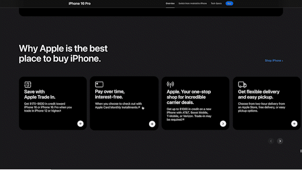
Apple systematically addresses all major hesitation points. It removes economic barriers through trade-in offers and interest-free payments. It eases convenience concerns with flexible delivery options and setup assistance. And it reduces technical anxieties by offering live shopping support.
This holistic approach builds a complete transition support system—going beyond simple price reductions to eliminate friction across the entire purchase journey.
(3) Decision Architecture: Reframing the Purchase Question
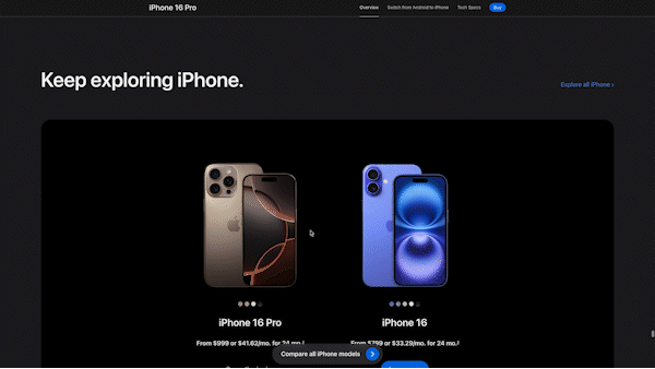
In the final step of the purchase journey, Apple uses a clever comparison between the iPhone 16 and iPhone 16 Pro to shift the user’s mindset. Instead of asking “Should I buy?”, users are guided to ask “Which one should I buy?” By framing it as a choice between two models—rather than a decision about buying at all—Apple subtly assumes the purchase is already happening.
This comparison also plays an emotional role: by presenting the base model alongside the Pro, Apple introduces a more affordable anchor that makes the premium version feel less intimidating. Users can easily see the added value of upgrading, but also recognize that the standard model is still a strong option.
To reinforce this, Apple displays monthly payment options for both models, making the price difference feel incremental rather than overwhelming. The result is a decision structure where both choices appear rational and satisfying—either as a smart upgrade or a sensible value pick.
Core Tactics 2: Value Progression in Content Structure
High-Converting Content Structure for the Desire Stage
While the AIDA model provides a useful framework for understanding the psychological stages of conversion to purchase, each stage demands a distinct persuasive strategy. In particular, the desire stage calls for a cognitive design approach that differs markedly from the attention and interest phases—which rely on sensory impact and curiosity.
Unlike earlier stages that aim to capture attention and spark exploration, desire requires a more structured progression of value. For users to fully absorb and emotionally invest in high-value offerings, content must be arranged in a way that reflects how people naturally process layered information.
At this point, a macro-level structure becomes especially visible—one that guides users from concrete, verifiable product qualities to more abstract, identity-relevant benefits. This progression reflects deliberate cognitive design rather than incidental layout.
The following section examines this macro-level content structure as a core tactic in how Apple builds desire. Part 2 will turn to the micro-level, analyzing how specific messaging elements bring this structure to life.
Information Processing Theory Behind Readable, High-Converting Pages
Apple’s product detail page doesn’t just present features—it mirrors how we naturally process information when evaluating high-value products. According to psychological research, our minds prefer to move from concrete facts to abstract meaning. We start by looking for physical evidence, then assess how something performs, and finally consider how it fits into our identity or lifestyle.
This progression follows a predictable cognitive path:
- Tangible Validation – Is it real and well-made? (e.g. titanium, build quality)
- Functional Assessment – Does it perform well? (e.g. A18 Pro chip, camera features)
- Self-Integration – Does it fit who I am? (e.g. personalization, values alignment)
This structure reflects key principles from Construal Level Theory, which explains how we interpret things differently depending on psychological distance, and Schema Theory, which shows that we make sense of new information by connecting it to familiar mental models.
By guiding users through this progression—starting from materials and performance, and ending with lifestyle and identity—Apple reduces cognitive friction and makes each value layer easier to absorb. The result is a landing page that feels natural, persuasive, and easy to follow.
From Tangible to Identity: Apple’s Value Structure for Desire
Apple’s product detail page implements a strategic progression from concrete to abstract value, building desire through four carefully sequenced layers:
Physical Value: Showcasing Tangible Quality to Build Trust in High-Converting Landing Pages
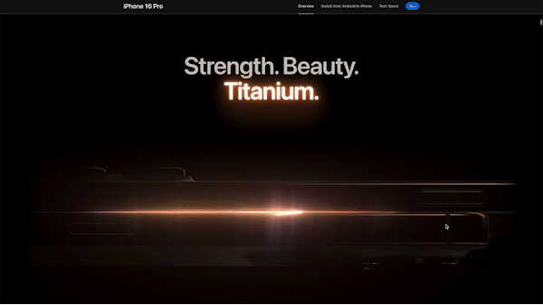
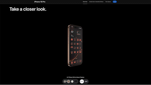
Apple begins with immediate, tangible qualities—leading with the line, “Strength. Beauty. Titanium.” This opening sets a foundation of material excellence, enhanced by luxury-inspired lighting and 360° interactive views that simulate hands-on inspection.
This stage triggers instant value recognition and builds trust in the product’s physical quality—laying the groundwork before introducing more complex value dimensions.
2) Blended Value: Technical and Experiential Design for Conversions
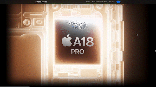
Rather than separating technical specifications from real-world use, Apple deliberately interweaves the two. Camera specs are shown through actual photos and videos. A18 Pro chip performance is demonstrated via real gaming experiences, not abstract benchmarks.
This strategic blending serves several purposes. It makes technical information instantly meaningful, reduces the mental effort required to connect features with benefits, and validates performance claims through visible, real-time outcomes.
3) Identity Integration: Personal Meaning and Value Alignment
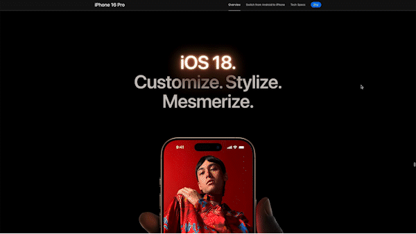
In the final Desire stage, Apple strategically emphasizes personalization to strengthen the iPhone 16 Pro’s connection to users’ identities. After establishing physical and functional value, the landing page shifts focus to customization—allowing users to tailor home screens, select personalized color themes, and configure interfaces that reflect their individual style.
Additional elements further deepen this personal alignment. Privacy-centric design reinforces a sense of control and trust, while environmental responsibility allows users to align their purchase with ethical and ecological values.
Together, these features connect the product to users’ broader personal and social identities—intensifying emotional resonance and reinforcing purchase intent.
By unfolding value in stages—from tangible quality to functional benefit to personal meaning—the page mirrors how users naturally build conviction. This gradual progression reduces resistance, deepens relevance, and makes the final decision feel personally inevitable.
What’s on Next?
In Part 1, we explored how Apple’s iPhone 16 Pro product detail page tackles the core challenge of premium tech marketing: justifying a $1,199+ purchase. The site uses a sophisticated information architecture rooted in consumer psychology and information processing theory.
This structure creates a natural progression that builds cumulative purchase confidence over time. At the macro level, it effectively guides users through each stage of a high-involvement decision—moving from initial value recognition to final conviction.
In Part 2, we’ll examine how this strategic foundation is reinforced through feature-level design decisions.