Your product page might look great. But if visitors aren’t buying, the problem is usually structure — not aesthetics. This iPhone 16 Pro breakdown shows exactly what Apple gets right — and how to apply the same principles to your own page.
Apple’s iPhone 16 Pro page converts at a rate few brands touch. And it’s not because of the brand name. It’s because every section is engineered around how people actually make purchase decisions.
This breakdown decodes that structure — and shows you how to apply the same principles to your own product page.
Series Overview
- Part 1: The AIDA Structure Behind Apple’s Product Page ← you’re here
- Part 2: The Design Elements That Make It Work
- Part 3: The CRO Framework You Can Apply
The iPhone 16 Pro Breakdown: AIDA Framework
This iPhone 16 Pro breakdown starts with the macro structure — the AIDA model that Apple follows — Attention, Interest, Desire, Action — but executes each stage with precision most brands miss.
Here’s what each stage actually does, and how Apple pulls it off.
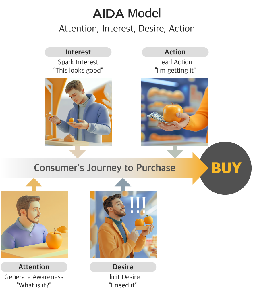
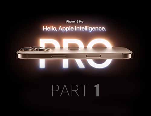
1. Attention — You have 3 seconds

Users form first impressions in 50 milliseconds. They decide whether to scroll or leave within 3 seconds.
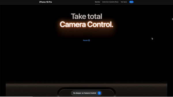
Apple’s hero section does one thing: deliver a single, unmissable message. Black background. Bold typography. One sentence: “Hello, Apple Intelligence.” No feature list, no price, no product comparison. Just enough to create one reaction — “I want to know more.”
The minimalist visual environment removes everything that could distract from that moment. The animation reveals copy slowly, giving each word space to land. What most brands get wrong here: Trying to say too much in the hero. Five selling points in the first viewport means the user registers zero.
2. Interest — Reward the scroll

Once attention is captured, users need a reason to keep going. The goal isn’t to inform — it’s to create curiosity.
Apple does this through progressive disclosure. Instead of listing all features at once, each scroll reveals one thing at a time. Feature previews hint at what’s coming without fully explaining it. Horizontal scrolling and interactive elements let users explore at their own pace.
The key mechanism: information is given in the order users are ready to receive it. Early sections stay high-level. Technical depth comes later, once interest is already established.
What most brands get wrong here: Front-loading specs before the user cares about them. Specs justify a purchase — they don’t start one.
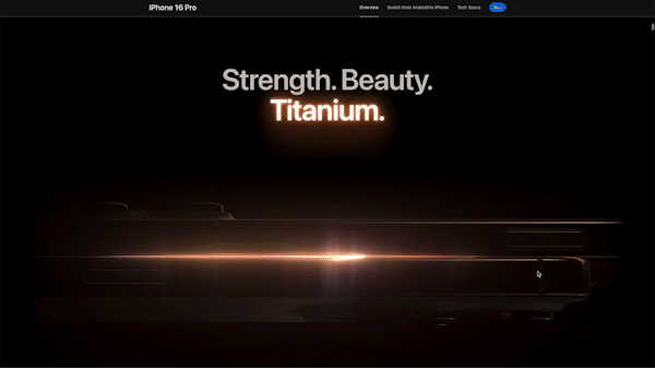
3. Desire — Make the product feel personal
Interest says “this looks good.” Desire says “I need this specifically.”. Apple builds desire through a deliberate content progression: Physical value → Functional value → Identity value
It starts concrete and gets personal:
- “Physical value — “Strength. Beauty. Titanium.” opens the desire stage. Controlled lighting traces the surface, and 360° interactive views let users inspect the device from every angle. The goal isn’t to show what the phone looks like — it’s to simulate the feeling of holding it. Trust in physical quality has to be established before any feature claim lands.
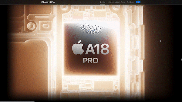
- Functional value — Camera capability is shown through actual shots, chip performance through real game footage. Apple never separates the spec from the proof. This matters because abstract benchmarks require cognitive effort to interpret — real results don’t. Seeing a photo taken on the phone is faster to process than reading “48MP Ultra Wide.”
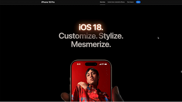
- Identity value — The final layer shifts from the product to the person. Home screen customization, privacy-centric design, and environmental responsibility aren’t just features — they reframe the purchase as a values-aligned decision. By the time a user reaches this section, they’re not evaluating a phone. They’re deciding whether this is a product for someone like them.
This sequence follows how people naturally evaluate high-value purchases: “Is it well-made?” → “Does it work?” → “Is it for someone like me?” Skipping to identity value before establishing physical and functional credibility doesn’t work. You have to earn it.
The dual-route approach: Apple simultaneously appeals to emotion (aspirational messaging, cinematic visuals) and logic (specs, real-world demos). For premium purchases, both routes need to be satisfied — emotion gets you interested, logic lets you justify the spend.
4. Action — Remove every reason not to buy
By this stage, the user wants the phone. Apple’s job is to remove every barrier between wanting and buying.
Apple does this through three moves:
1) Reframe the price
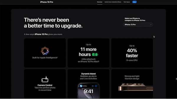
“There’s never been a better time to upgrade” — comparative framing. The question shifts from “Is this worth $1,199?” to “How much better is this than what I have?”
Monthly payment options make the number feel smaller. A model dropdown shows quantified gains — 60% faster, 16 more hours of battery — turning abstract price into concrete value.
2) Remove purchase anxiety
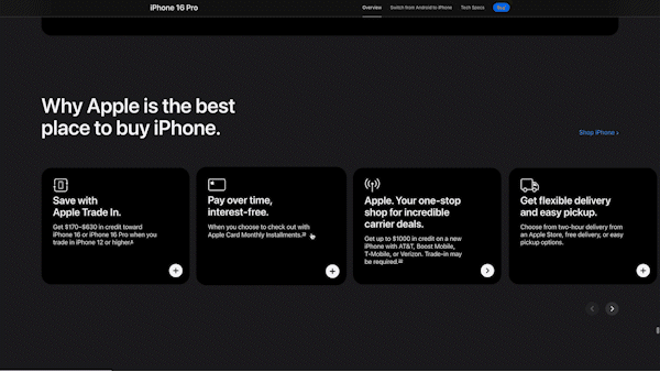
Trade-in program, interest-free payments, flexible delivery, live shopping support. Apple addresses every category of hesitation: financial, logistical, technical. Not just price — the full spectrum of friction.
3) Reframe the decision
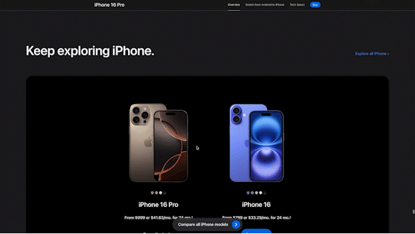
iPhone 16 vs. iPhone 16 Pro comparison near checkout is a deliberate move. It shifts the question from “Should I buy?” to “Which one?”
The cheaper model isn’t a fallback — it’s an anchor that makes the Pro look more reasonable. Presenting both with monthly pricing turns a $1,199 decision into a $33/month one.
Apply This to Your Page
Everything in this iPhone 16 Pro breakdown points to the same insight: conversion is a sequence, not a single button. These principles work across any product page.
Before your next redesign, check:
- Does your hero deliver one message in under 3 seconds — or does it try to say everything at once?
- Does your content move from physical → functional → personal relevance, or does it lead with specs?
- Have you addressed all three purchase barriers: financial, logistical, trust?
- Does your CTA section reframe the decision, or just repeat “Buy Now”?
If the answer is no to any of these, that’s where your conversions are leaking.
In Part 2, we go deeper into the specific design elements — interaction patterns, visual hierarchy, and luxury cues — that make this structure work at the micro level.