In Part 1, we decoded the macro structure of the iPhone 16 Pro page — how Apple follows the AIDA model to build purchase confidence stage by stage. This iPhone 16 Pro breakdown goes one level deeper: the specific design decisions that make each section actually work.
This isn’t about aesthetics. Every element on this page serves a conversion function.
Series Overview
- Part 1: The AIDA Structure Behind Apple’s Product Page
- Part 2: The Design Elements That Make It Work ← you’re here
- Part 3: The CRO Framework You Can Apply
The iPhone 16 Pro Breakdown: Design Elements
1. Message Design — Emotion First, Logic Second
Apple doesn’t choose between emotional and rational persuasion. It uses both, in sequence. For a $1,199 purchase, users need to want the product before they’re willing to evaluate it. Then they need evidence to justify what they already want.
1) The peripheral route comes first
Sensory and emotional cues that build initial appeal without requiring deep analysis:

- Cinematic visuals and aspirational messaging establish desire
- Social proof through brand authority builds initial trust
- Lifestyle framing connects the product to identity
2) The central route follows
Logical verification for users ready to evaluate:
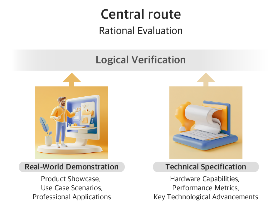
- Real-world demonstrations show actual results
- Technical specs provide the evidence users need to justify the spend
- Comparisons give logical permission to choose the premium option
3) Example1 — the camera section: Turning Pro-Level Dreams Into Persuasive Proof
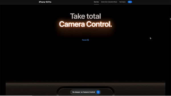
Apple doesn’t open with “48MP Ultra Wide camera.” It opens with the feeling of being a professional filmmaker. “Take total Camera Control” — paired with cinematic visuals and a physical UI modeled on professional camera dials.
Only after that emotional hook does Apple introduce ProRAW format, Dolby Vision recording, and the Weeknd music video shot entirely on iPhone 16 Pro. The sequence: aspiration → endorsement → specification. Not the other way around.
4) Example 2 — the satellite section: Selling Safety Through Fear and Relief

The satellite communication feature targets a completely different emotional driver: fear. “No signal? There’s a satellite for that” — visuals of stranded hikers, remote landscapes, zero cell coverage.
The peripheral route activates first: anxiety about being unreachable in an emergency. Then the central route delivers: coverage area specs, response times, how the system actually works. Same dual-route structure, opposite emotional starting point. One sells aspiration. The other sells reassurance. Both follow the same sequence.
What most brands get wrong here: Leading with specs activates the central route before the peripheral route has done its job. Users haven’t decided they want it yet — so the specs don’t land.
2. Interaction Design — Match Complexity to Engagement
Apple structures interactions in three stages, matched to the user’s level of engagement:
1) Stage 1: Static displays
Single message, no interaction required.
Used in hero sections and comparison charts. When the goal is clarity, low interactivity wins.
| Layout | Interaction | Purpose and Effect |
|---|---|---|
| Full-Screen Single Message | Static | Purpose: Deliver core value propositions Effect: Maximum message clarity through focused attention Example: Hero section |
| Text-Dense Grid | Static | Purpose: Present technical information efficiently Effect: Support rational evaluation Example: Product comparison charts |
2) Stage 2: Guided movement
Scroll-based animations, auto-play carousels.
Used for feature introductions. The system controls pacing, while users stay passive as key information lands.


| Layout | Interaction | Purpose and Effect |
|---|---|---|
| Carousel (Auto) | Guided Movement | Purpose: Deliver key features one at a time with visual clarity Effect: Allow paced discovery and maintain user focus Example: “Get the Highlights” feature carousel |
| Immersive Scroll | Guided Movement | Purpose: Deliver key messages with emotional impact Effect: Create immersion and highlight product sophistication Example: Camera intro with immersive video and scrolling text |
| Vertical Scroll | Guided Movement | Purpose: Let users feel the impact of each option Effect: Enhance emotional engagement and intuitive preference Example: Photography Styles scroll interaction |
3) Stage 3: User-driven exploration
360° product views, horizontal scroll, tab structures.
Used once interest is established. Users who actively engage retain information better and build stronger purchase intent.

| Layout | Interaction | Purpose and Effect |
|---|---|---|
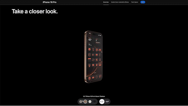
| 360° Product View | User-Driven Exploration | Purpose: Let users explore the physical design in 3D with visual and tactile cues Effect: Simulate hands-on experience and reinforce premium material perception Example: Take a closer look section |
| Horizontal Scroll | User-Driven Exploration | Purpose: Demonstrate camera functionality through interactive simulation Effect: Promote active learning and confidence by mimicking real user actions Example: Camera capabilities section |
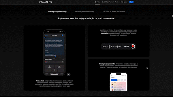
| Tab Structure | User-Driven Exploration | Purpose: Break down complex feature sets into manageable, categorized sections Effect: Support focused exploration while minimizing cognitive overload Example: Apple Intelligence details |
The progression matters. Asking users to actively explore before they’re interested creates friction. Starting passive and gradually handing over control mirrors how buying decisions actually develop.
What most brands get wrong here: Either everything is static (boring, low engagement) or everything is interactive (overwhelming, high cognitive load). The mix needs to match where the user is in the decision process.
3. Visual Language — Communicate Value Without Words
Apple uses visual design to communicate premium quality before a single word is read.
1) Minimalism as a signal
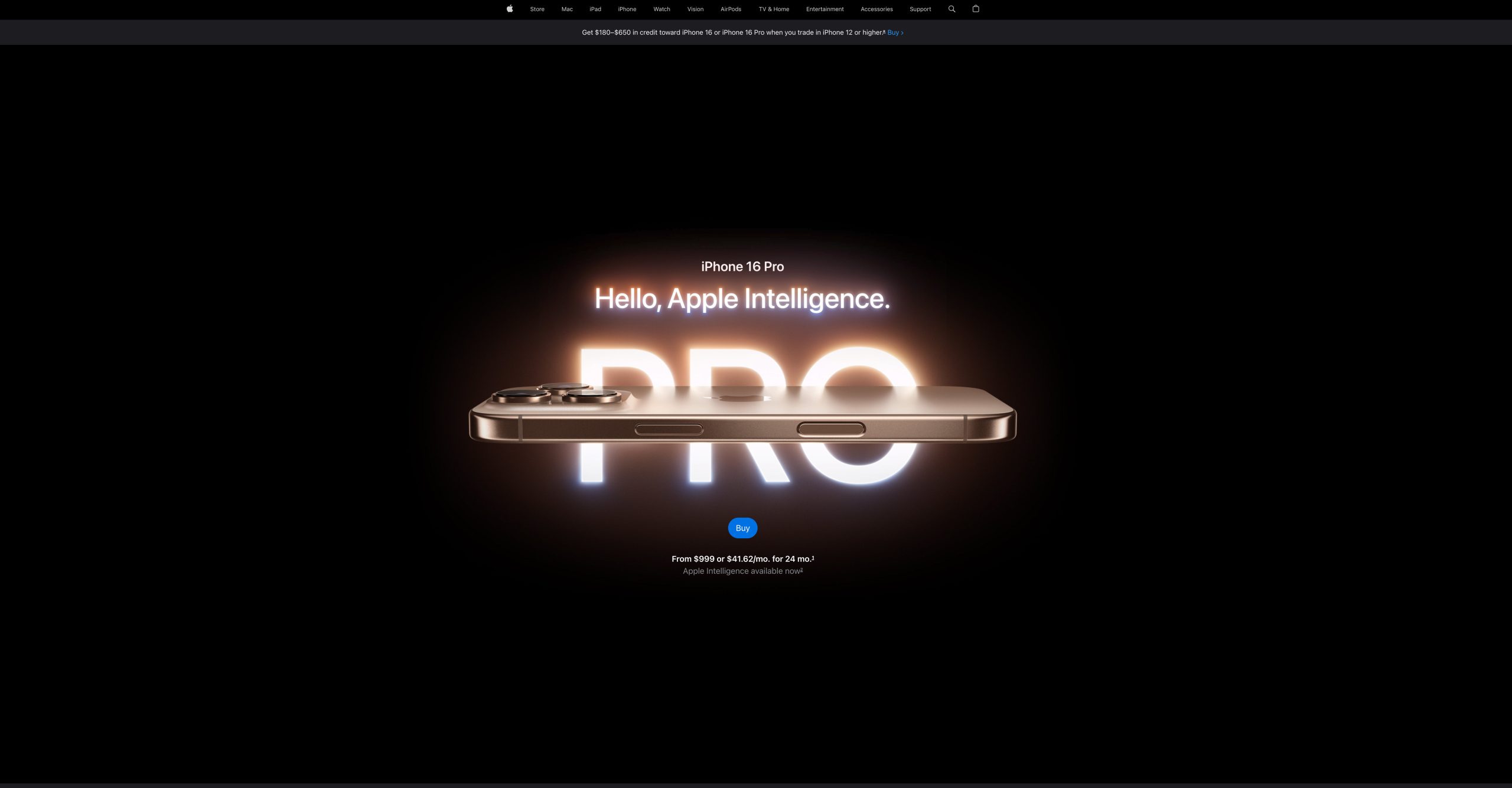
The hero section places one product on a black background with no UI elements. In luxury marketing, empty space signals confidence. A product that needs to fight for attention isn’t premium.
2) Lighting as texture

Controlled highlights move across the titanium surface to reveal grain, curves, and edge transitions. The craftsmanship is visible — not just implied. This is the visual equivalent of letting someone hold the product in their hands.
3) Motion as quality cue

Fast cuts feel cheap, whereas slow angles let each surface speak. The pacing mirrors the product’s own precision.
4) Color as restraint
Dark neutral palette. Muted tones. No attention-seeking boldness. Luxury is defined by what’s removed, not what’s added.
These aren’t aesthetic choices — they’re conversion mechanics. Premium visual language makes the $1,199 price feel like less of a stretch.
Apply This to Your Page
Everything in this iPhone 16 Pro breakdown points to one principle: every visual decision is a conversion decision.
Message design:
- Map your content to emotional appeal first, rational validation second
- Find the aspiration your product enables — lead with that, not the specs
- Use real-world results to bridge emotion and logic
Interaction design:
- Audit your page for cognitive load — are you asking users to engage before they’re interested?
- Use static displays for complex information, guided movement for emotional sections
- Reserve interactive elements for users who’ve already shown intent
Visual language:
- Remove everything from your hero that isn’t the core message
- If your product photography doesn’t communicate quality, the copy won’t save it
- Slow down motion — fast animations communicate cheapness, not excitement
In Part 3, we turn all of this into a framework you can apply to any product page — regardless of brand or price point.
