Apple’s iPhone 16 Pro product detail page exemplifies premium digital product marketing, with product detail pages that reflect a persuasive, research-informed conversion framework. Designed to justify premium pricing and build purchase confidence, these pages distill years of brand dominance and cognitive strategy into a seamless user experience.
Our previous analysis explored Apple’s product detail page conversion design from a broad structural perspective. Now, we turn specifically to the content—examining how individual elements transform features into persuasive purchase arguments. This micro-level analysis of product detail pages reveals actionable techniques for designing content that naturally guides users toward conversion.
For any brand selling high-value products online, the principles embedded in Apple’s landing page design offer invaluable insights for optimizing conversion through targeted persuasion structures.
Series Overview
- The Structure of High-Converting Landing Pages
- Landing Page Design Elements That Drive Conversions
- Conversion Rate Optimization Framework
Key Takeaways
Apple’s landing page(product detail page) designed to persuade through multiple layers that align with how users think, feel, and decide.
- Emotional and rational appeals are combined through dual-route persuasion (based on the Elaboration Likelihood Model), so that each feature both inspires users and logically justifies the product’s value.
- Interaction flows are structured around user intent—starting with simple, static displays, then guiding attention through scroll-based storytelling, and finally inviting users to actively explore as their interest grows.
- Visual design reinforces premium positioning, using minimalist layouts, precise lighting, and subtle motion to communicate material quality—borrowing cues from luxury branding to support higher pricing.
Landing Page Design Elements That Drive Conversions
What makes Apple’s approach to landing page—particularly product detail page—conversion design effective is its seamless integration of cognitive principles with aesthetic execution.
In the sections that follow, we’ll examine three core tactics that support this integrated system: how content design aligns with cognitive processing to guide users toward deeper desire, how interaction patterns enhance understanding and emotional engagement, and how visual communication techniques reinforce premium positioning while encouraging action.
Core Tactics 1. Message Design Strategy for Landing Page Conversion (Based on ELM)
The iPhone 16 Pro’s product detail page uses a message design strategy informed by the Elaboration Likelihood Model (ELM), a psychological theory that explains how persuasion works through two main paths: the peripheral route and the central route.
In the context of premium smartphones—high-involvement purchases that demand careful consideration—effective landing page conversion design requires activating both routes. Apple applies this dual-route strategy consistently across the site, guiding users from initial interest to confident conversion.
Peripheral Route: Delivering Quick Value Propositions

The peripheral route enhances intuitive and emotional appeal within landing page conversion design through a carefully orchestrated mix of elements.
Sensory components—such as refined visual design, distinctive typography, and subtle animation—immediately signal premium positioning without requiring deep analysis.
These sensory cues work alongside emotional elements, including aspirational messages and storytelling that link the product to desirable lifestyle outcomes.
At the same time, social validation is reinforced through brand authority and expert credibility. These signals build trust and create a strong first impression—before users invest significant cognitive effort in processing technical information.
Central Route: Supporting Rational Evaluation
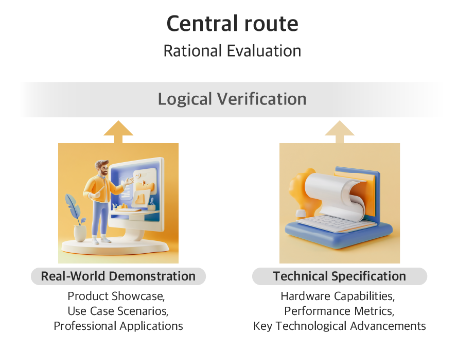
The central route delivers logical verification through complementary approaches that appeal to analytical thinking.
First, real-world demonstrations place the product in authentic contexts. These include relatable usage scenarios, tangible result samples that prove its capabilities, and professional applications that highlight versatility and performance.
Next, technical specifications reinforce these examples with detailed hardware capabilities, comparative performance metrics, and explanations of key technological advancements. These details help differentiate the product from its competitors.
Together, these rational elements provide the substantive evidence users need when they move beyond first impressions and begin a deeper evaluation. This logical support is essential for building confident purchase decisions.
ELM in Action: Apple’s Landing Page Design Strategy
Camera System: Turning Pro-Level Dreams Into Persuasive Proof
The camera system addresses a core user desire: achieving professional-level photography and videography with tools that feel accessible and empowering.
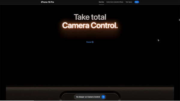
Apple’s product detail page conversion design begins by establishing emotional resonance. The “Take total Camera Control” section introduces a physical UI modeled after the manual dials of professional cameras. Users can adjust exposure and depth directly, gaining tactile control. Paired with cinematic visuals and messaging like “Take total Camera Control,” this design evokes the feeling of being a skilled filmmaker—even before technical features are introduced.
Next, Apple reinforces this perception through rational validation. It highlights advanced tools such as Dolby Vision recording and audio mixing, positioning the iPhone as a serious video production device. Immediately after, Apple anchors credibility by referencing The Weeknd’s groundbreaking music video—shot entirely on iPhone 16 Pro. This real-world example enhances perceived legitimacy and subtly implies that professionals trust the device.
Finally, Apple presents concrete technical specifications. These include the 48MP Ultra Wide camera, ProRAW format, and enhanced image processing. Such features confirm that the iPhone 16 Pro is not merely aspirational, but fully capable of professional-grade content creation.
Taken together, this progression—emotional framing, expert endorsement, and technical proof—forms a persuasive narrative. It blends creativity with credibility, positioning the iPhone 16 Pro as a tool for both aspiring creators and working professionals.
Reinforcing Trust Through Fear Mitigation and Functional Proof

While the camera system appeals to aspirational desires for creative mastery, the Satellite Communication feature engages a very different emotional driver: fear and the need for safety. In this case, Apple adopts a contrasting persuasion approach—tapping into emotional vulnerability while reinforcing the message with functional credibility.
On the emotional front, Apple leverages the peripheral route to address anxiety around being disconnected in emergencies. Messaging like “No signal? There’s a satellite for that” directly evokes common fears of isolation. Visuals of stranded hikers and remote landscapes further amplify this emotional framing, presenting the iPhone as a lifeline when all else fails.
To complement this emotional appeal, Apple activates the central route through technical validation. Demonstrations illustrate how the satellite system operates—how users can contact emergency services without cell coverage. Detailed specs such as coverage areas and response times provide concrete evidence of the system’s reliability.
By combining emotional reassurance with logical proof, Apple speaks to both instinctive fears and rational needs. The result is a persuasive narrative that transforms a niche feature into a compelling reason to choose the iPhone—especially when safety is at stake.
Core Tactics 2. Layout and Interaction Patterns That Enhance Conversion
Effective information design starts with an understanding of users’ cognitive limits. Cognitive Load Theory (Sweller, 1988) explains that working memory can typically hold only 3 to 5 discrete items at a time (Cowan, 2001), and unless actively processed, this information fades within 10 to 20 seconds. This constraint is especially critical when presenting complex product features on a digital page.
Apple’s iPhone 16 Pro product detail page applies this principle strategically. Through thoughtful layouts and guided interactions, it supports cognitive processing and improves information retention.
Mapping Layout Types to User Interaction Patterns
Static Displays for Clarity
| Layout | Interaction | Purpose and Effect |
|---|---|---|
| Full-Screen Single Message | Static | Purpose: Deliver core value propositions Effect: Maximum message clarity through focused attention Example: Hero section |
| Text-Dense Grid | Static | Purpose: Present technical information efficiently Effect: Support rational evaluation Example: Product comparison charts |
Guided Interactions for Momentum


| Layout | Interaction | Purpose and Effect |
|---|---|---|
| Carousel (Auto) | Guided Movement | Purpose: Deliver key features one at a time with visual clarity Effect: Allow paced discovery and maintain user focus Example: “Get the Highlights” feature carousel |
| Immersive Scroll | Guided Movement | Purpose: Deliver key messages with emotional impact Effect: Create immersion and highlight product sophistication Example: Camera intro with immersive video and scrolling text |
| Vertical Scroll | Guided Movement | Purpose: Let users feel the impact of each option Effect: Enhance emotional engagement and intuitive preference Example: Photography Styles scroll interaction |
User-Driven Exploration for Deeper Engagement

| Layout | Interaction | Purpose and Effect |
|---|---|---|
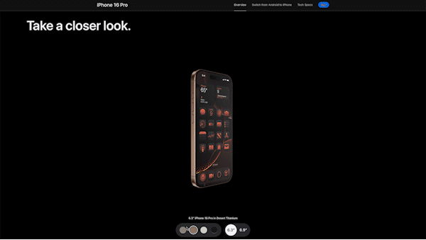
| 360° Product View | User-Driven Exploration | Purpose: Let users explore the physical design in 3D with visual and tactile cues Effect: Simulate hands-on experience and reinforce premium material perception Example: Take a closer look section |
| Horizontal Scroll | User-Driven Exploration | Purpose: Demonstrate camera functionality through interactive simulation Effect: Promote active learning and confidence by mimicking real user actions Example: Camera capabilities section |
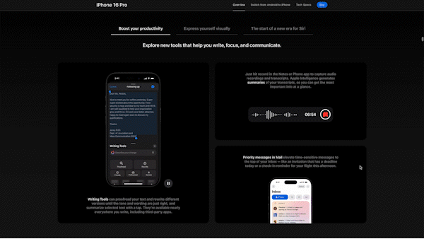
| Tab Structure | User-Driven Exploration | Purpose: Break down complex feature sets into manageable, categorized sections Effect: Support focused exploration while minimizing cognitive overload Example: Apple Intelligence details |
Progressive Engagement in Landing Page Conversion Design
Effective interaction design aligns with how users absorb information.
The Progressive Engegement Framework structures interaction in stages—from passive exposure to active exploration—adapting to users’ cognitive and motivational states throughout the purchase journey.
The experience begins with single-message layouts. These static visuals require no interaction and deliver one clear idea, such as a product slogan or material highlight. By reducing distraction, they capture attention and leave a strong impression.
Static layouts also appear later in the journey. Sections like specification grids or feature comparisons involve little interaction but demand focused reading and deliberate analysis. In this context, low interactivity supports high cognitive effort—showing that simplicity can still drive engagement.
Guided movement includes scroll-based animations and auto-play feature highlights. These interactions direct attention through pacing and sequencing. While users remain mostly passive, the system still shapes how they process information. This stage supports early learning through effects like primacy and recency, helping key features stand out.
As interest deepens, user-driven exploration invites active participation—tapping to expand specs, adjusting features, or comparing models. This shift to central processing boosts retention through the generation effect, as users invest more effort and build personal relevance.
Throughout the experience, interactivity increases with user intent, but clarity and structure remain constant. Each layer is designed to balance attention, effort, and comprehension.
As users shift from passive viewing to active engagement, their cognitive investment deepens—making information not only more persuasive, but also more likely to be encoded into long-term memory.
Core Tactics 3. Visual Strategy for Premium Product in Persuasive Landing Page Conversion Design
Apple emphasizes the use of premium titanium in the iPhone 16 Pro to elevate its perceived value over the standard iPhone 16. This material framing plays a key role in justifying the device’s higher price positioning.
This approach aligns with insights from luxury marketing research, which identify material quality as a key differentiator in premium products. As Kapferer and Bastien explain in The Luxury Strategy, visible craftsmanship and material excellence are central to luxury purchase decisions—helping consumers rationalize elevated pricing through sensory cues of quality.
To achieve this effect, Apple draws on visual techniques rooted in luxury branding. Controlled lighting, minimal layouts, and cinematic pacing are used to accentuate the titanium’s surface. These cues elevate the perception of material value and create a sense of crafted exclusivity.
Importantly, the emphasis isn’t just on the material itself, but on how it’s made. Close-up angles, light tracing along contours, and slow, deliberate motion allow users to visually experience the craftsmanship—mirroring the feel of examining a high-end object in person.
Minimalist Framing to Signal Crafted Exclusivity
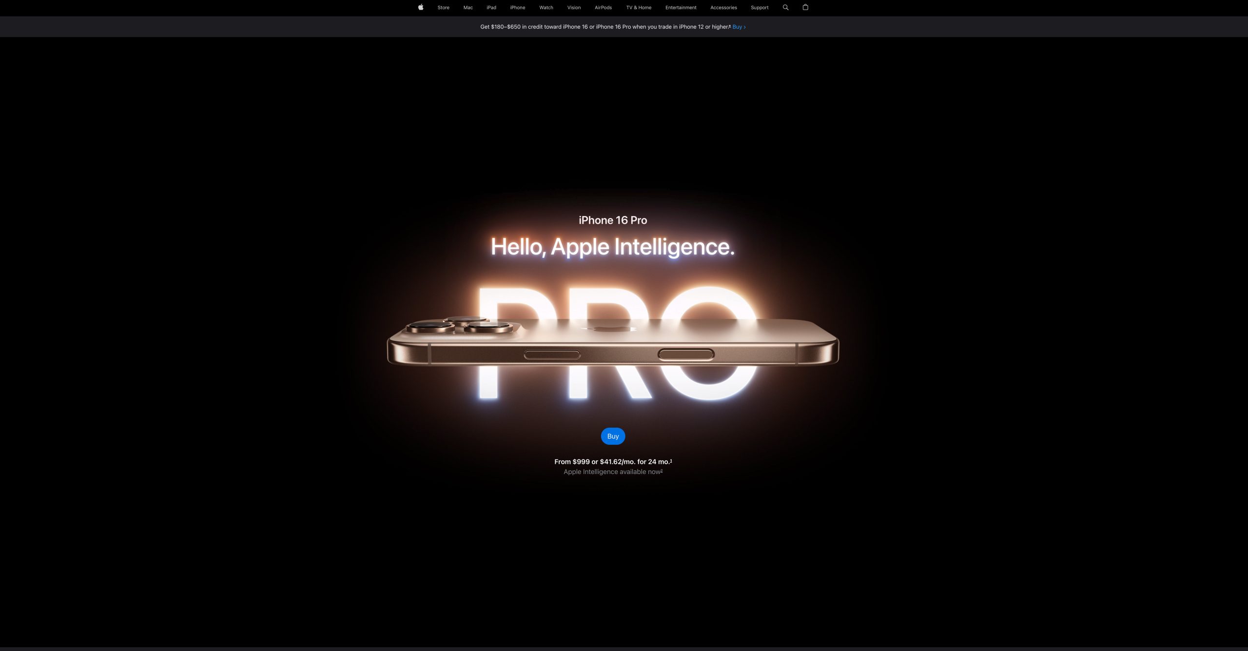
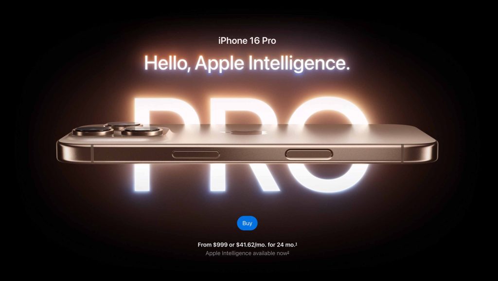
Minimalism & Negative space: The hero section of the iPhone 16 Pro product detail page immediately establishes a sense of exclusivity. The product appears alone, centered on the screen, surrounded by a deep black background with no distractions or interface elements. This minimalist framing places undivided visual focus on the device, creating a clear product-first hierarchy where form and material take center stage.
In luxury marketing, such minimalist presentation is used to elevate perceived value by removing all visual noise. The absence of clutter signals confidence—when a product is truly premium, it doesn’t need to fight for attention. The empty space around the object becomes part of the storytelling, creating a rhythm of stillness and intention that invites closer inspection.
Color palette: A dark, neutral color palette enhances the titanium’s presence, allowing light to play across its surface without distraction. In luxury branding, such muted tones are often used to convey restraint and timelessness—offering a sense of quiet confidence rather than attention-seeking boldness.
Paired with generous negative space, the palette creates a visual atmosphere where luxury is defined not by excess, but by intentional simplicity. The product feels rare not because it’s surrounded by more, but because it’s surrounded by less.
Visual Execution for a Sense of Quality


Lighting as Texture and Structure : Throughout the iPhone 16 Pro product detail page, light is used not just for illumination, but to shape perception. Controlled highlights move across the titanium surface to reveal subtle curves, material grain, and edge transitions—giving users a visual sense of both texture and construction.
Rather than relying on extreme close-ups, the page uses light and angles to define the sharpness of each cut and the smooth precision of each boundary. Material junctions are clearly and deliberately rendered, reinforcing the idea that nothing about the design is accidental. The titanium doesn’t just shine—it’s presented in a way that makes its craftsmanship visible and tangible.
Slow, Deliberate Motion: Camera movement is equally restrained. Instead of fast cuts or rapid transitions, the site uses slow, intentional angles that give each surface time to speak. This visual pacing mirrors the product’s own precision—every motion feels crafted, every frame deliberate.
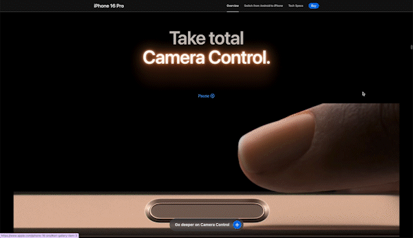
Form as Function, Framed: Design details are not just shown—they’re positioned to express their purpose. The structure of the iPhone 16 Pro, from the curvature of the lens housing to the integration of the action button, is presented in a way that connects form directly to function. In sections like the camera control demo, physical elements are aligned with on-screen actions, making the design feel purposeful and intuitive.
By framing these transitions with clarity and precision, the site doesn’t just highlight how the product looks—it shows how it works, and why it’s built that way.
What’s on Next?
Our micro-level analysis reveals how Apple’s sophisticated design decisions serve one clear purpose: building purchase confidence for a $1199+ product. Through strategic layout choices, dual-route persuasion techniques, and premium visual language, each feature section is carefully crafted to both emotionally resonate and rationally validate. This meticulous attention to feature-level presentation, working in concert with the macro-level structure examined in Part 1, demonstrates how effective premium product websites must address both intuitive appeal and logical justification to drive conversion.
In Part 3, we’ll examine how these insights can be applied to other high-involvement purchase experiences.