This is an Apple landing pages design evaluation — how the same brand builds two premium product pages, one year apart, for the same price tier. In our iPhone 16 Pro breakdown (Part 1, Part 2), we decoded how Apple sells a $1,199 phone — AIDA structure, dual-route persuasion, progressive interaction design, luxury visual language.
Then Apple released the iPhone 17 Pro. Same price tier. Same AIDA skeleton. But if you put the two pages side by side, key elements from the 16 Pro playbook are missing. This post explains why — and what it means for how you sell premium products.
What Disappeared — and What Replaced It
Here’s what the 16 Pro page had that the 17 Pro page doesn’t:
| iPhone 16 Pro | iPhone 17 Pro |
|---|---|
| “Hello, Apple Intelligence.” — single bold hero message | No text. Product image only. |
| “Take total Camera Control” — new feature framed through pro filmmaker identity | “A big zoom forward.” — new feature framed through capability demonstration |
| The Weeknd music video — celebrity endorsement proving the camera’s credibility | ProRes RAW, Apple Log 2, genlock — industry-standard tool specifications |
| Titanium close-ups with controlled lighting tracing the surface grain | Aluminum unibody cross-section showing vapor chamber engineering |
| “There’s never been a better time to upgrade” — explicit purchase justification | Gone. No upgrade pitch. |
| “Designed to make a difference” — environmental messaging to ease purchase guilt | Buried. Present but low in the page hierarchy. |
Every item on the left is a persuasion element we analyzed in the 16 Pro breakdown. The question this Apple landing pages design evaluation asks is why Apple chose to change them.
The AIDA Structure Stayed. The Content Inside It Didn’t.
The AIDA structure didn’t change. What changed is what fills each stage.
Attention: From Declaration to Silence
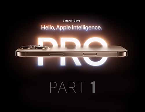
The 16 Pro hero said “Hello, Apple Intelligence” — one sentence, black background, bold type. We analyzed this as a textbook Attention execution: single message, minimal environment, instant value recognition.
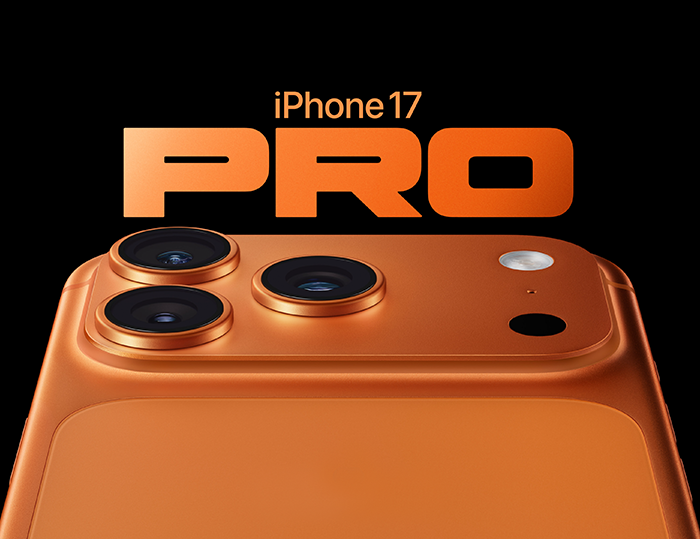
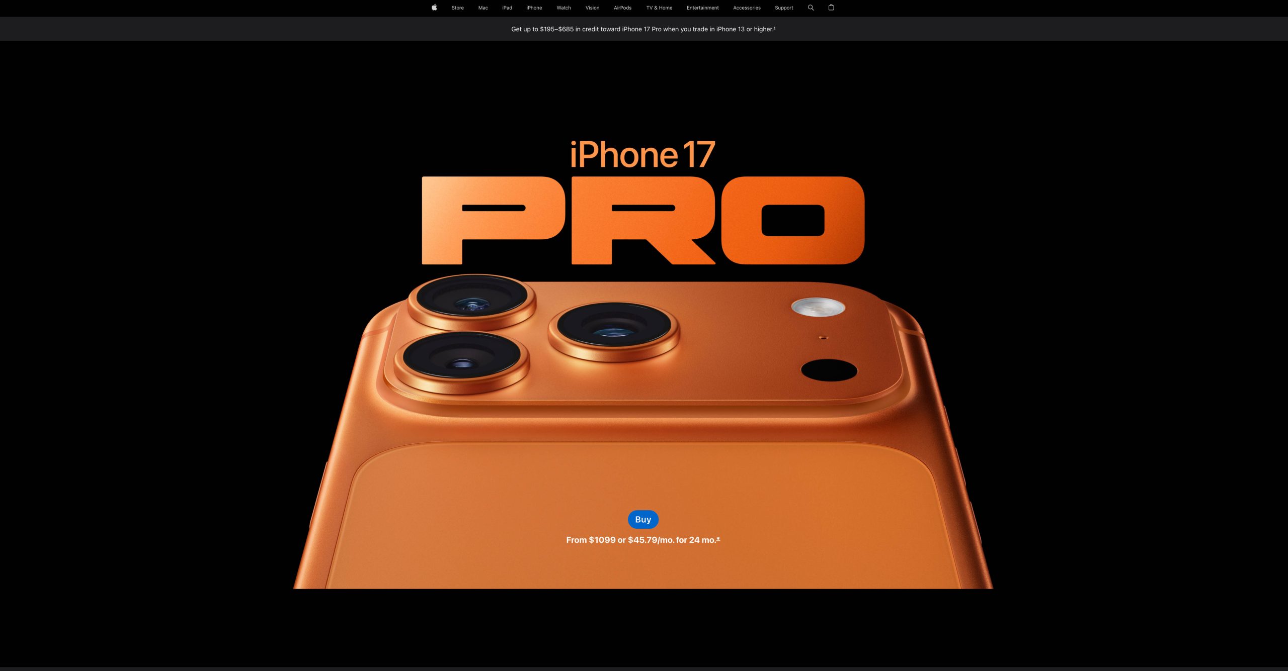
The 17 Pro hero says nothing. Just the device — Cosmic Orange, aluminum unibody, horizontal camera plateau — on a dark background. This works because the 17 Pro’s design change is dramatic enough to communicate visually. The 16 Pro looked like the 15 Pro. It needed text to signal what was new. The 17 Pro looks like nothing before it — new material, new camera layout, new proportions. The product is the message.
The principle: Text in a hero section compensates for what the visual can’t communicate alone. When the product’s physical form already says “this is new,” text becomes noise.
Interest: Similar Format, Similar Function

Both pages use the same “Get the highlights” carousel — short preview cards summarizing key features. The 16 Pro led with “The first iPhone built for Apple Intelligence. Personal, private, powerful.” The 17 Pro leads with “Heat-forged aluminum unibody design for exceptional pro capability.” Different features, but the same format: one-line previews designed to reward the scroll.
The highlights carousel isn’t where the strategy diverges. That happens in the next stage.
Desire: Identity Frame vs. Capability Frame
This is where the biggest shift happened. The detailed Design, Camera, and Performance sections are where the 16 Pro built desire through what we called “dual-route persuasion” in Part 2 — peripheral hooks paired with central-route validation. The 17 Pro takes a different approach in each.
Camera
The 16 Pro presented Camera Control through an identity frame — “Take total Camera Control” paired with cinematic visuals and a physical UI modeled on professional camera dials. Before any spec appeared, the page made you feel like a professional filmmaker. The Weeknd’s music video extended this frame — a real artist, using this tool, on a real production. The feature was real. The framing wrapped it in an identity: you’re a creator.

The 17 Pro presents its 8x telephoto through a capability frame — “A big zoom forward” followed by focal length demonstrations from 13mm to 200mm with sample shots at each distance. No identity setup. ProRes RAW, Apple Log 2, and genlock are listed as professional tool specifications, framed as what the camera does rather than who you become by using it.
The features in both sections are real and impressive. The difference is whether the page builds an identity around them first (16 Pro) or lets them stand on demonstrated capability alone (17 Pro).
Satellite connectivity

This is the clearest example because the product didn’t change. The 16 Pro framed satellite connectivity through anxiety: “No signal? There’s a satellite for that.” — evoking the fear of being stranded, then offering relief. We analyzed this in Part 2 as a peripheral-route hook using a different emotional driver than the camera section: fear instead of aspiration.
The 17 Pro presents the same feature as: “Stay connected. On and off the grid.” — a calm capability statement. No scenario. No anxiety. Just what it does.
Apple could have kept the fear framing — the feature hasn’t changed. They chose not to. Whether that’s because repeating an emotional hook loses impact the second time, or because the page’s overall tone shifted toward capability language, the observable result is the same: emotional framing replaced by factual framing, on a feature that is identical between generations.
Visual design language remains consistent.
The Cosmic Orange color, deliberate product animations, and minimal framing carry over the same premium positioning principles we analyzed in Part 2. What changed isn’t how the 17 Pro looks — it’s how it argues.
Action: Same Content, Different Space

Trade-in, financing, model comparison, environmental messaging — the elements that reduce purchase friction and reframe the buying decision are largely the same. What changed is how the page separates them from everything above.
The 17 Pro shifts to a white background for the Action stage, creating a hard visual break from the dark theme used throughout the rest of the page. The 16 Pro kept a more continuous visual flow.
This connects to an established principle from physical retail design. Stores deliberately use different visual environments for shopping zones and checkout zones — different lighting, layout, density (Kotler, 1973; Underhill, 1999). The reason: browsing and buying require different mindsets, and mixing the two creates ambiguity about what the customer should be doing. Apple’s own stores do this — the product table area and the checkout/Genius Bar area feel like different spaces.
The 16 Pro’s emotional flow worked like a luxury boutique — aspiration carried naturally from product display to purchase, no hard boundary needed. The 17 Pro’s technical evaluation content works more like an electronics showroom — you’re comparing, analyzing, verifying. When that evaluation is done, you need a clear signal to step from the showroom to the counter. The white background is that signal.
Why Apple Made These Choices
More models, more confusion risk
Brand architecture research consistently finds that when a product lineup expands, the biggest risk is cannibalization and consumer confusion. The more models share similar features and messaging, the harder it becomes for consumers to understand what each one is for — and the more likely they are to either freeze or default to the cheapest option.
The 16 series could afford a shared hero. Two main tiers (standard and Pro), clear physical differences (aluminum vs titanium, dual vs triple camera), and one narrative — “Hello, Apple Intelligence” — that worked across both.
The 17 series has five models across four product pages. And the price gaps are tight: Air sits at $999, Pro at $1,099 — a $100 difference. With that kind of proximity, shared messaging would blur the line between models. Each page needs to communicate what this model is immediately.
Each page differentiates through language
Look at the heroes:
| Model | Hero |
|---|---|
| iPhone17e ($599) | “Feature stacked. Value packed.” |
| iPhone17 ($799) | “Magichromatic.” |
| iPhone Air ($999) | “The thinnest iPhone ever.” |
| iPhone17 Pro ($1,099) | (No text) |
And this extends beyond heroes. The 17e uses rhymes and energy throughout — “Looooong battery life,” “go, go, go all day,” “Blasts and lasts.” The 17 leads with aesthetics — “Even more delightful. Even more durable,” “looks — and stays — beautiful.” The Air sustains sensory language — “impossibly thin,” “nearly disappears in your hand.”
The Pro page leans on capability language — 8x zoom, vapor chamber, ProRes RAW, Apple Log 2. Not because it abandoned emotion, but because in a five-model lineup, professional tool specifications are the fastest way to distinguish “Pro” from everything else — especially from Air, one tier below at $100 less.
This is what ties the changes together. The consistent move toward more direct, specification-led communication we traced through each AIDA stage serves the same purpose: making it immediately clear what “Pro” means in a five-model lineup.
What This Means for Your Product Page
This analysis comes down to one question:
How many products is your lineup asking consumers to distinguish between?
If the answer is two or three with clear physical differences, a shared narrative can work. That’s what we saw with the 16 Pro — same hero message, same emotional toolkit, Our Part 1 and Part 2 breakdown covers exactly how.
If the answer is four or five — especially at tight price gaps — each page needs to differentiate fast. The language on each page becomes a positioning tool: it’s not just describing features, it’s telling the consumer which product this is and who it’s for within seconds of landing. The 17 Pro shows what that looks like for a professional tier: direct specification language that makes “Pro” unmistakable.
The 16 Pro approach isn’t outdated. The 17 Pro approach isn’t superior. The lineup changed, and the page’s job changed with it.